Emissions in the USA
In 2020, the United States was the second highest contributor of greenhouse gas emissions, globally1. Generally, sources of emissions are classified as either Point or Nonpoint. Point sources are emissions that can be attributed to specific places, such as power plants or airports, while nonpoint sources are aggregates of emissions that cannot be traced to a single location but rather are estimated across a space.
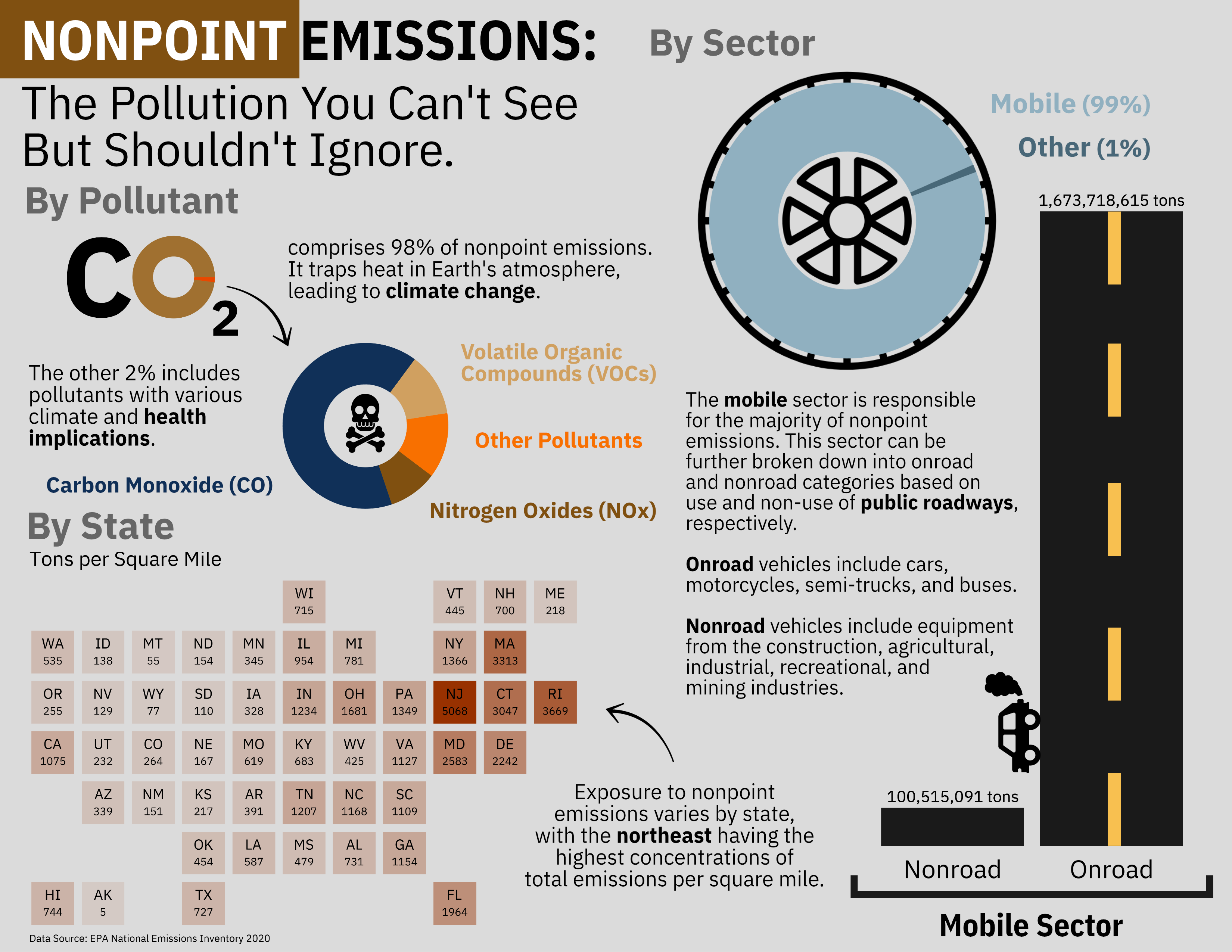
In the Environmental Protection Agency’s (EPA) National Emissions Inventory (NEI) dataset, point sources comprise 98% of emissions (in tons) reported in the 2020 release. Even though nonpoint sources only represent the remaining 2%2, they are still responsible for 2.4 gigatons of emissions: a weight equivalent to approximately 375 Pyraminds of Giza. Since it’s inherently harder to conceptualize these unseen sources, I decided to focus on breaking down the who, the what, and the where of nonpoint emissions3.
Design Choices
I chose three fundamental graphic forms (a bar chart, a donut chart, and a map), created them in {ggplot}, and assembled them using Affinity. To answer “who is responsible for nonpoint emissions,” I used a donut chart to breakdown total nonpoint emissions (in tons) by sector. This led to the finding that the majority of emissions come from the Mobile sector, which I further broke down into two categories (Onroad and Nonroad). To investigate the relative contribution of each category, I used a bar chart to visually compare lengths (representative of tons of emissions). Originally, I had planned to use these bars as “smokestacks”, but I changed my mind because I felt that smokestacks better represented point sources better than nonpoint sources. I used additional donut charts to answer the question “what pollutants comprise nonpoint emissions.” After finding that CO2 was the vast majority by weight (98%), I made a second donut chart to break down the remaining pollutants. Finally, I determined that the best way to answer “where are nonpoint emissions concentrated” was to show the spatial allocation of emissions (in tons) per square mile on a stylized map of the U.S. with states shaded by magnitude. Since larger states tended to emit more, I chose to normalize by area (square mile) to give a better sense of how states related to their emissions contributions, especially since they were represented by equal area squares in the map.
I used text annotations to guide the reader through the infographic and point out the main takeaways for each of my three questions and their corresponding sections. I labeled the bars on the bar chart to distinguish between the two Mobile sector categories and annotated with the total tons of emissions for each. I also included simple text legends for my donut charts, with the text colored to match the chart. I chose to add a subtitle to the map to make it clear what the units (tons/square mile) were.
I used theme_void() for all my base themes to make customizing the overall style relatively simple. I didn’t include axes on any of my graphs because I relied on color and relative size to convey the necessary information without overloading on numbers. I felt that numbers were difficult to contextualize, especially in tons, and I wanted my overall infographic to be free from the clutter of grid lines and extra axes.
I intentionally filtered color palettes for colorblind-friendly options. I pulled specific colors from “palettetown::gloom” (such as the red for the map and the yellow for the lines on the road) to fit the overall theme of the larger infographic without being overwhelming on the color front. I think the dark color of the “road” bar chart balances the brighter colors, and I opted for a solid light gray background for contrast. I chose the dark red color for the map since it didn’t immediately infer any connections to individual pollutants on the donut chart, as the map represents total nonpoint emissions (across all pollutants) per square mile. The dark red elicits some sense of “danger” without being too alarming. The collection as a whole helps to convey the “doom and gloom” emotion that I am trying to invoke with my exploration of emissions.
I chose to use a bolded IBM Plex Sans Condensed for title text and a normal IBM Plex Sans for subtext (annotations, axis labels, etc.) because it has a modern, respectable presence without being overly official. I used bold typeface for the section titles to draw the readers attention to the who (By Sector), the what (By Pollutant), and the where (By State). I also bolded a few key words that summarized the takeaways/implications for each section.
I chose relatively simple graphic forms as well as a simple general layout to avoid information overload. I removed most of the legends and/or opted for simple text legends where possible. I used minimal objects and turned the Onroad bar into a road to make it visually enticing yet still informative. By removing axes and non-essential graphic elements, I did my best to generally minimize the data-ink ratio.
I stylized the sector donut chart as a wheel (thanks, Sam, for the suggestion!) and included one small car object to contextualize the focus on the Mobile sector as the majority sector responsible for nonpoint emissions. This, in combination with the “road” bar chart, further helps to place responsibility for the majority of Nonpoint emissions on the mobile sector, including cars and trucks. I also contextualized the health implications of various pollutants with a small skull and cross bones graphic.
Nonpoint emissions are such that they do not have a specific fixed location. Thus, my primary message revolves around uncovering the who, the what, and the where concerning nonpoint emissions. I wanted to convey that nonpoint emissions are not insignificant and are more relevant in our daily lives than we may realize.
Emissions come from many, many sources. In some sense, the who of nonpoint emissions really includes everyone, as most people can relate to driving a car, taking public transportation, or even contributing to the larger network of shipping through online purchases or getting groceries. My intention was to send the message that nonpoint emissions are more tangible than the name leads us to believe. By giving some context to these emissions, I hope people will think about their individual contributions and make changes to their driving habits where they can.
You can access my code for each graph by clicking on the respective arrows below.
Code
Load Data + Packages
# -------- Load packages --------
library(tidyverse)
library(here)
library(ggwordcloud)
library(geofacet)
library(paletteer)
library(showtext)
library(patchwork)
library(janitor)

# -------- Load data --------
emissions_cleaned_non_point <- read_csv(here("posts/", "2025-03-11-nonpoint-emissions/", "data", "emissions_cleaned.csv"), show_col_types = FALSE) %>%
  clean_names()

# -------- Load fonts ---------
showtext_auto()

# Import Google fonts
font_add_google(name = "IBM Plex Sans Condensed", family = "ibm_condensed")
titletext <- "ibm_condensed"

font_add_google(name = "IBM Plex Sans", family = "ibm_plex")
subtext <- "ibm_plex"
Bar Graph
# -------- Emissions data for mobile sector --------
road_data <- emissions_cleaned_non_point %>%

  # Filter for the "Mobile" sector
  filter(str_detect(eis_sector, "Mobile")) %>%

  # Label by "Mobile" sector subcategories
  mutate(cleaned_subsector = case_when(
    str_detect(eis_sector, "Commercial Marine Vessels") ~ "Other",
    str_detect(eis_sector, "Locomotives") ~ "Other",
    str_detect(eis_sector, "Non-Road") ~ "Nonroad",
    str_detect(eis_sector, "On-Road") ~ "Onroad"
  )) %>%

  # Calculate emissions for each subcategory
  group_by(cleaned_subsector) %>%
  summarise(total_emissions = sum(emissions_tons))


# -------- Mobile sector bar chart --------
road <- road_data %>%

  # Remove "Other" category to focus on onroad/nonroad relationship
  filter(cleaned_subsector != "Other") %>%
  ggplot(aes(cleaned_subsector, total_emissions)) +

  # Choose dark gray color
  geom_bar(stat = "identity", fill = "gray10") +

  # Label bars with emissions totals (in tons)
  geom_text(aes(cleaned_subsector, total_emissions, label = scales::label_comma(accuracy = 1, suffix = " tons")(total_emissions)),
            vjust = - 0.5,
            size = 5,
            family = subtext) +

  # Set base theme
  theme_void() +

  # Adjust theme
  theme(

    # Add x axis text
    axis.text.x = element_text(family = subtext,
                               size = 25,
                               # Move labels closer to bars
                               margin = margin(t = -20,
                                               b = 10)),
    # Set aspect ratio
    aspect.ratio = 2,

    # Remove legend
    legend.position = "none",

    # Extend plot margin
    plot.margin = margin(t = 0,
                         r = 10,
                         l = 10,
                         b = 0)
  )

# View
road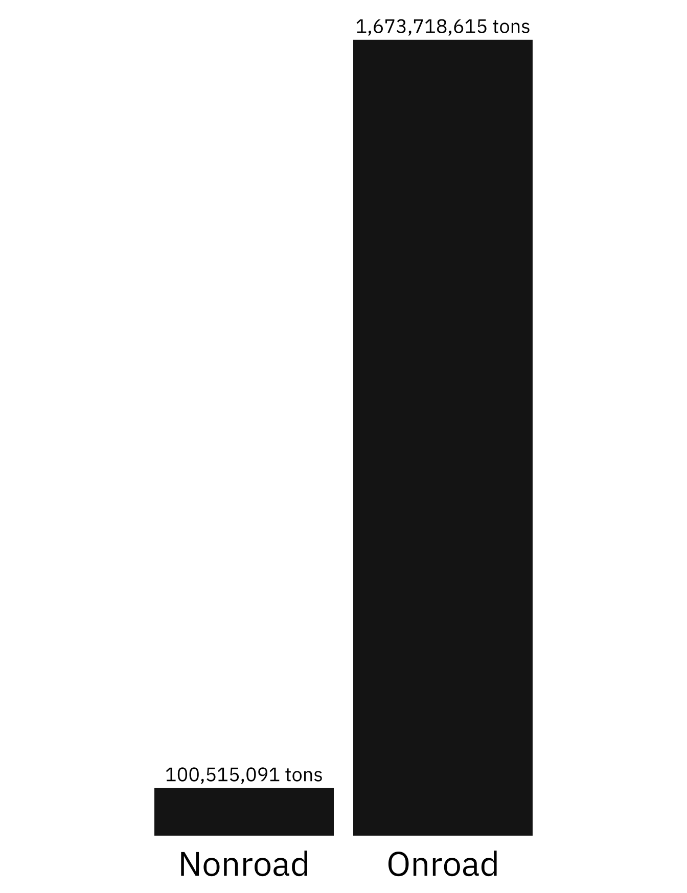
Map
# -------- Convert built-in state.area to a df --------
state_data <- data.frame(
  state = state.name,
  abbrv = state.abb,
  area = state.area
)

# --------- Merge state and emissions dfs --------
state <- emissions_cleaned_non_point %>%
  left_join(state_data, by = "state") %>%
  group_by(state, abbrv, area) %>%
  summarise(total_emissions = sum(emissions_tons)) %>%
  mutate(rel_emissions = total_emissions/area) %>%
  arrange(desc(rel_emissions)) %>%
  ungroup() %>%
  mutate(opacity = rel_emissions/max(rel_emissions))

# Define specific colors
core = "#983100" # from gloom palette
accent = "gray20"

# -------- Create map --------
map <- ggplot(state) +

  # Initiate plot, shading by concentration (opacity value)
  geom_rect(aes(xmin = 0, xmax = 1, ymin = 0, ymax = 1, alpha = opacity),
            fill = core) +

  # Label with state abbreviation
  geom_text(aes(x = 0.5, y = 0.7, label = abbrv),
            size = 7,
            family = subtext) +

  # Label with tons/square mile
  geom_text(aes(x = 0.5, y = 0.3, label = round(rel_emissions, 0)),
            size = 5,
            family = subtext)  +

  # Break rectangle up by state
  geofacet::facet_geo(~state) +

  # Make each rectangle the same size
  coord_fixed(ratio = 1) +

  # Add description line as subtitle
  labs(subtitle = "Tons per Square Mile",
       caption = "Data Source: EPA National Emissions Inventory 2020"
       ) +

  # Set base theme
  theme_void() +

  # Customize theme
  theme(

    # Remove headers
    strip.text = element_blank(),

    # Adjust the subtitle
    plot.subtitle = element_text(family = subtext,
                                 size = 15,
                                 margin = margin(b = 10)),

    # Adjust the caption
    plot.caption = element_text(family = subtext,
                                size = 10,
                                margin = margin(t = 10),
                                hjust = 0),

    # Remove legend
    legend.position = "none",

    # Adjust plot margins
    plot.margin = margin(b = 10,
                         t = 10,
                         r = 20,
                         l = 20)
  )

# View
map
Sector Donut
# -------- Emissions by sector --------
sector <- emissions_cleaned_non_point %>%
  mutate(sector = ifelse(str_detect(eis_sector, "Mobile"), "Mobile", "Other")) %>%
  group_by(sector) %>%
  summarise(emissions_tons = sum(emissions_tons, na.rm = TRUE)) %>%
  mutate(label = paste0(sector, " (", round((emissions_tons/sum(emissions_tons))*100, 0), " %)"))

# -------- Donut chart --------
sector_donut <- ggplot(sector, aes(x = 2, y = emissions_tons, fill = label)) +
  geom_bar(stat = "identity", width = 1) +

  # Use polar coordinates
  coord_polar(theta = "y", start = 0) +

  # Create hole
  xlim(0.5, 2.5) +

  # Set base theme
  theme_void() +

  # Adjust theme
  theme(

    # Set legend
    legend.position = "right",

    legend.title = element_text(family = subtext,
                                size = 20,
                                face = "bold"),

    legend.text = element_text(family = subtext,
                               size = 15),

    # Set plot margin
    plot.margin = margin(r = 20, l = 20)

    ) +

  # Title legend
  labs(fill = "Sector") +

  # Use full gloom palette
  scale_fill_paletteer_d("palettetown::gloom")

# View
sector_donut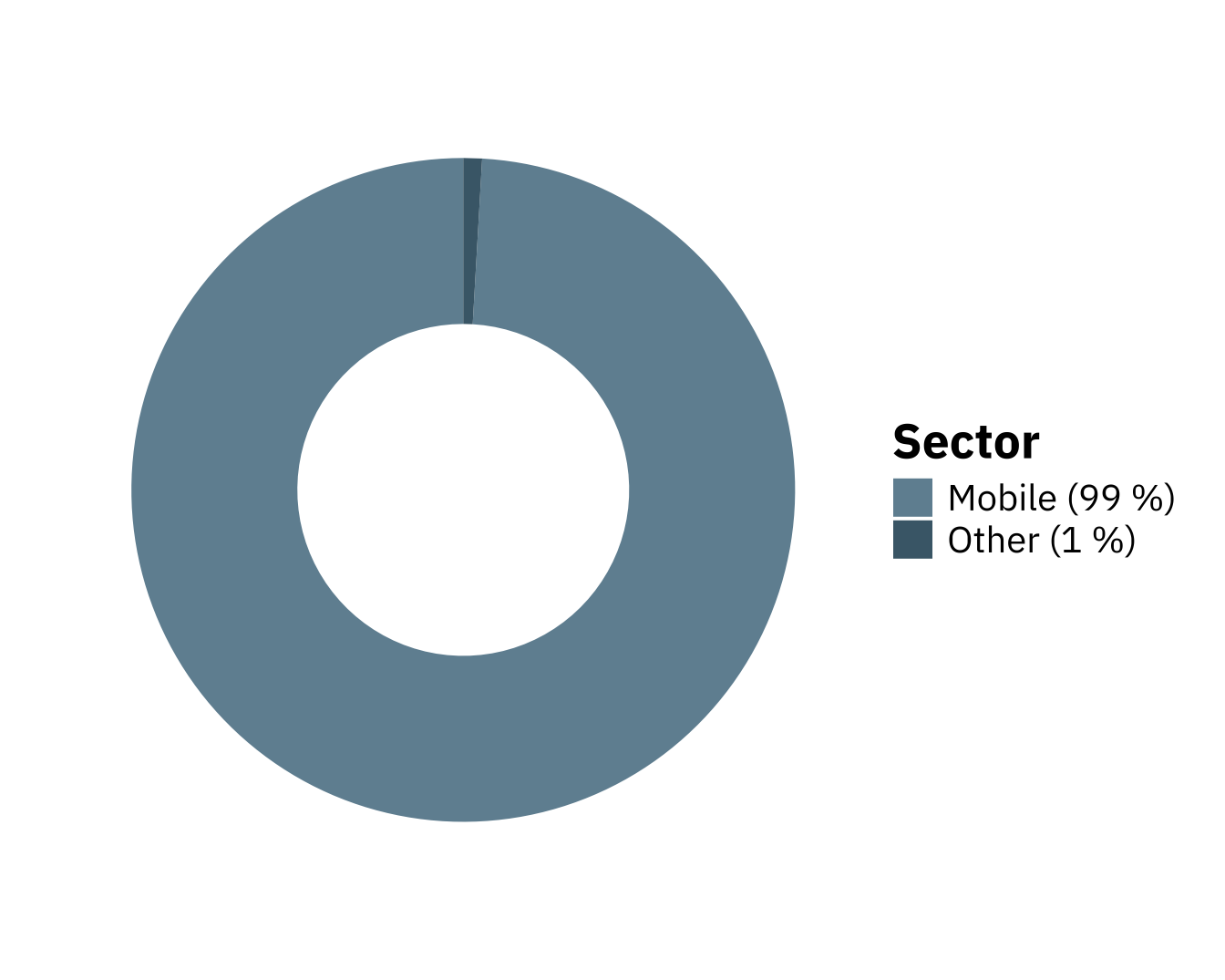
Majority Pollutant Donut
# -------- Pollutants by weight --------
all_pollutants <- emissions_cleaned_non_point %>%
  mutate(category = ifelse(pollutant == "Carbon Dioxide", pollutant, "Other")) %>%
  group_by(category) %>%
  summarise(emissions_tons = sum(emissions_tons)) %>%
  mutate(prop = round(emissions_tons/sum(emissions_tons) * 100, 0)) %>%
  mutate(label = paste0(category, " (", prop, " %)"))

# -------- Pollutants Donut --------
pollutants <- ggplot(all_pollutants, aes(x = 2, y = prop, fill = category)) +
  geom_bar(stat = "identity", width = 1) +

  # Use polar coordinates
  coord_polar(theta = "y", start = 0) +

  # Create hole
  xlim(0.5, 2.5) +

  # Set base theme
  theme_void() +

  # Adjust theme
  theme(
        legend.position = "right",

        legend.title = element_blank(),

        legend.text = element_text(family = subtext,
                                   size = 10),

        # Set plot margin
        plot.margin = margin(r = 20, l = 20)

        ) +

  # Remove first two colors already used in sector donut
  scale_fill_manual(values = paletteer::paletteer_d("palettetown::gloom")[-c(1:2)]
)

# View
pollutants
Other Pollutant Donut
other_pollutants <- emissions_cleaned_non_point %>%
  mutate(category = ifelse(pollutant %in% c("Carbon Dioxide", "Carbon Monoxide", "Volatile Organic Compounds", "Nitrogen Oxides"), pollutant, "Other")) %>%
  group_by(category) %>%
  summarise(emissions_tons = sum(emissions_tons)) %>%
  mutate(prop = round(emissions_tons/sum(emissions_tons) * 100, 3)) %>%
  mutate(label = paste0(category, " (", prop, " %)")) %>%
  filter(!category == "Carbon Dioxide")

# --------- Other pollutant donut --------
pollutants_2 <- ggplot(other_pollutants, aes(x = 2, y = emissions_tons, fill = category)) +
  geom_bar(stat = "identity", width = 1) +

  # Use polar coordinates
  coord_polar(theta = "y", start = 0) +

  # Create hole
  xlim(0.5, 2.5) +

  # Set base theme
  theme_void() +

  # Set legend
  theme(
        legend.position = "right",

        legend.title = element_blank(),

        legend.text = element_text(family = subtext,
                                   size = 10),

        # Set plot margin
         plot.margin = margin(r = 20, l = 20)

        ) +

  # Remove first 4 colors that have been used
  scale_fill_manual(values = paletteer::paletteer_d("palettetown::gloom")[-c(1:4)])

# View
pollutants_2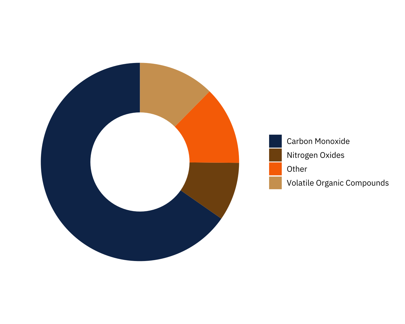
Footnotes
To give this better context, the brown box behind “nonpoint” in the infograhpic title represents 2% of the total page space, proportional to the contribution of nonpoint emissions to total emissions.↩︎